|
|
Post by dem0n on Nov 18, 2006 3:13:54 GMT 1
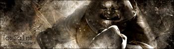
See how i progress from start...1-  2- (used a whole tutorial with hardly any creativity involved u could call it cheating  )  3-  4- (First sig ever made for someone and yes it looks crap)  5-(Here's when i really started to use brushes and colour balance)  6-  7-  8-  9-  10-  11-  12-  13- 
|
|
|
|
Post by -Ben- on Nov 19, 2006 1:33:30 GMT 1
that RF nail is pretty cool dude. and that demon one. but there i dont like much the text+blended render+border.
bg is ok
|
|
|
|
Post by dem0n on Nov 19, 2006 18:50:03 GMT 1
how did u do urs i mean 1rst bg 2nd render 3rd...for example. I've only just started sig making and any advice is appreciated.  |
|
|
|
Post by dem0n on Nov 19, 2006 18:54:49 GMT 1
oh an btw which font did ya use for the exiled-creative text on the bottom left-hand side of your sig??? ;D
|
|
|
|
Post by -Ben- on Nov 20, 2006 1:43:58 GMT 1
i think its bit2dust. but im not sure. well, bg..u can use brushes or make em by your own. about the render..you have many blen options..try out and blend it more..btw u also can use brush to blend the render. about..just put the text on where it looks like something coolness where it fits the sig. im not a fan of big texts. u also can google for tuts for text/background/brushing/blending etc. |
|
|
|
Post by dem0n on Nov 20, 2006 18:05:38 GMT 1
ah bugger couldnt find the font but oh well. Yh i agree with ya ben ill look into it thanks for help m8. |
|
|
|
Post by -Ben- on Nov 21, 2006 22:57:51 GMT 1
nps dude. tuts are made to help other designer watch out. ive made also few tuts just have a look through the forum ^.^ |
|